Live long and prosper – move out of NW6
Maps have always been a powerful way of highlighting London’s social inequalities (Charles Booth‘s and John Snow‘s are the most iconic examples of this) and they continue to show how the richest and poorest Londoners often live side by side.
(SpatialAnalysis.co.uk)
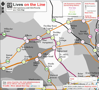
The latest map from UCL’s Spatial Analysis team overlays two sets of data – life expectancy and child poverty. The team wanted to see whether the adage held true that a year in life expectancy is lost for every station eastbound on the Jubilee Line between Westminster and Canning Town.
You can read the full article for the methodology, or click the map for the full view of London, but lets look briefly at the findings locally.
People living within 200 metres of both TfL’s West Hampstead stations have a life expectancy of 81. This is pretty much bang on the national average (which is 78 for men and 82 for women) but lower than our neighbours to the south on the Jubilee Line, to the west on the overground and Bakerloo, and on a par with that in Kilburn.
It’s not especially surprising that wealthy St John’s Wood (83) or Maida Vale (86) have higher life expectancies. In fact the borough of Westminster has the second highest life expectancy in the country, but perhaps marginally surprising that West Hampstead fares as well (or as badly) as Kilburn Park or Kilburn High Road. If we look at the Guardian’s deprivation map from April this year, we can see that the West Hampstead stations are marginally better off than Kilburn’s stations, and the child poverty data above tallies with that. So, why the discrepancy?
Frankly, that’s not the right question to be asking. This sort of mapped analysis is not intended to be a perfect reflection of the reality on the ground. Mapping is all about scale, and this London life expectancy map is best seen as a way to see general changes along tube lines, where the trends are very clear. There is, for example, an astonishing 21-year difference between the shortest (75.3) and longest (96.4) life expectancies. However, when you see that the longest life expectancy is for Oxford Circus and think how many people live within 200 metres of that tube station, you begin to see the challenge of trying to derive meaningful insights from individual data points. This doesn’t detract from the fact that there are large discrepancies, most notably from west to east – this is even more visible when you look at the child poverty data.
You may think this is old news, but as a way to bring to life the concept not just of deprivation but of disparity, maps are surprisingly powerful. Take a look at the routes you regularly use to get around London, and next time you whoosh through the city (or, more pertinently, go to the Olympic Park) on a tube train, have a think about the areas you’re passing through out of sight. Maybe also have a think about whether a child born in east London deserves a lower life expectancy just because of where their parents live.


Leave a Reply
Want to join the discussion?Feel free to contribute!