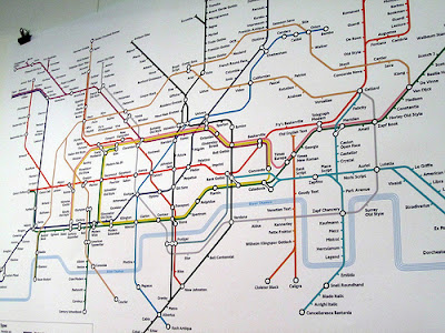
Travesty (would be a good name for a font)
The redoubtable Annie Mole, whose Going Underground blog is one of London’s finest, today posted a photo of yet another tube map mashup. We’ve had lots of these of late – puns on film titles, anagrams, movies shot in the location – all following in the footsteps of Simon Patterson’s 1992 work, The Great Bear.
Today’s addition to the fold is from Eiichi Kono, the man responsible for the distinctive New Johnston typeface used on the standard map. Here, Kono has replaced all the stations on the modern tube map with the names of typefaces, so Waterloo is Frutiger, Liverpool Street is Baskerville, etc.
 |
| Photo courtesy of Annie Mole |
Except he hasn’t replaced all the stations. Two – just two – are omitted*. West Hampstead and Finchley Road stations are marked on the map but have no associated typeface. Why would we be snubbed in such a way!?
Here’s a larger version of the photo above. Which typefaces would you choose to go on the map for West Hampstead and Finchley Road? Which would capture something of the essence of these two stations?

