Travesty (would be a good name for a font)
The redoubtable Annie Mole, whose Going Underground blog is one of London’s finest, today posted a photo of yet another tube map mashup. We’ve had lots of these of late – puns on film titles, anagrams, movies shot in the location – all following in the footsteps of Simon Patterson’s 1992 work, The Great Bear.
Today’s addition to the fold is from Eiichi Kono, the man responsible for the distinctive New Johnston typeface used on the standard map. Here, Kono has replaced all the stations on the modern tube map with the names of typefaces, so Waterloo is Frutiger, Liverpool Street is Baskerville, etc.
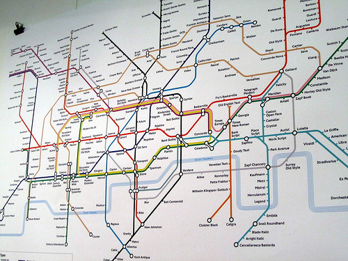 |
| Photo courtesy of Annie Mole |
Except he hasn’t replaced all the stations. Two – just two – are omitted*. West Hampstead and Finchley Road stations are marked on the map but have no associated typeface. Why would we be snubbed in such a way!?
Here’s a larger version of the photo above. Which typefaces would you choose to go on the map for West Hampstead and Finchley Road? Which would capture something of the essence of these two stations?
Why?
For West Hampstead, I suggest either Marquisette BTN or Papyrus, and for Finchley Road, Viner Hand ITC.
Agree with Phillip – and can be interchanged with any other arcane, pretentious or flimsy type: You think you're snubbed – us South Londoners are lucky even to get a couple typefaces down our way.
Stop complaining Anonymous (no.2). South of the river you get the fantastic Cancelleresca Bastarda. What more could you want?
Someone's just told me that Monument's missing as well, so don't feel totally snubbed 😉
I'll side step that obvious provocation (I only fight on the weekend) – but no, it's the kind of namby pamby, curly serif script that you can keep to be honest – and not particularly welcome round here. (Anonymous 2).
Given that Hampstead is ‘Berthold Grotesque,’ how about ‘Bertold Imago’ for West Hampstead?
As West Finchley is ‘Microgramma’ (as used on Casio calculators of the 70s), a related typeface for Finchley Road would be ‘Eurostile Extended No. 2.’
Monument is also missing. ‘Trajan’ is relevant.
Pity he didn’t have ‘Russell Square’ for Russell Square.;
By the way, I think that Simon Patterson, the artist who created ‘The Great Bear,’ one of the first tube map mashups, must be a local.
He assigned names of footballers to Jubilee line stations. He chose ‘John Barnes’ for Finchley Road!
Using the same logic, if one of the lines going through Sloane Square was ‘Sitcom Actors,’ he could rename it ‘Peter Jones.’
haha – very good. I see West Hampstead was Paul Gascoigne. Not sure how I feel about that… brilliant but ultimately flawed – a tragic hero.